This case study explores the redesign of the registration and onboarding flow for a private social media app focused on memory sharing and personal connections. Our goal was to improve the first-time user experience by reducing friction, guiding users seamlessly through setup, and establishing trust and clarity from the first tap.
Redesigning the Registration & Onboarding Experience for a Private Social App
.png)
- Mobile App
- B2C
- Social Media
- Native Mobile App
- Development Phase
- Consulting
- 2025
Overview
Myseum is a private social media app designed to help users preserve personal memories, connect with loved ones, and build a meaningful digital legacy. Unlike traditional social platforms, Myseum focuses on intentional, emotionally resonant sharing—allowing users to document life milestones, family stories, and personal reflections in a secure and distraction-free environment. The app enables users to:
- Create a timeline of personal moments
- Share updates privately with close friends and family
- Collaborate on memory collections
- Share updates privately with close friends and family
- Maintain control over who sees what
The Challenge
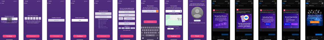
The original onboarding experience was outdated, overly linear, and lacked clear guidance. Users often dropped off before completing registration or found it confusing to set up key elements like profile info and location. Additionally, the UI did not align with the emotional tone of the app, which is centered around meaningful memories and personal storytelling. Key issues with the old design (see reference image):
- Lack of visual feedback during steps
- Poor hierarchy and guidance
- No personality or emotional tone in the UI
- Unclear progress tracking
- Low engagement on final onboarding screens
Design Process
We followed a structured design process to identify pain points, prototype solutions, and validate improvements:
Research & Analysis
Reviewed analytics, user feedback, and industry benchmarks to understand drop-off points and UX gaps in the old flow.User Journey Mapping
Created a revised flow with key milestones: phone verification, password setup, profile creation, location tagging, and introductory walkthroughs.Wireframing & Prototyping
Built mid- and high-fidelity wireframes to visualize flow improvements, reduce steps where possible, and align design with the brand’s emotional tone.Concept Design
Introduced a modern, vibrant color scheme and components that support trust, ease, and emotional connection. Elements such as illustrations and animations were explored to soften the experience.Functional Testing & Iteration
Usability feedback and performance metrics guided our refinement of copy, layout spacing, button placement, and help cues.Research Insights
To redesign the Myseum onboarding experience, we conducted a focused research phase aimed at understanding where users were struggling—and why. This involved a combination of usability reviews, stakeholder interviews, and user feedback analysis. Our Process Included:
- Reviewing analytics from the original onboarding flow to identify drop-off points
- Conducting user interviews to understand expectations, pain points, and emotional needs during registration
- Mapping competitor experiences to benchmark best practices in onboarding design
- Running heuristic evaluations to uncover usability issues and accessibility gaps
What We Discovered
- Drop-off at phone verification due to lack of feedback and unclear error handling
- Confusion around profile setup, especially regarding the purpose of location and profile photo steps
- Emotional disconnect — users didn’t feel guided or welcomed into the experience, which is crucial for an app centered around memories and personal storytelling
- No clear understanding of app value — users completed onboarding without knowing what to do next or why the app mattered
- Limited personalization — one-size-fits-all onboarding failed to adapt to different user goals or familiarity with private social platforms
These insights directly shaped our redesign strategy, helping us simplify steps, clarify purpose, and design an experience that’s as thoughtful as the memories Myseum is meant to preserve.

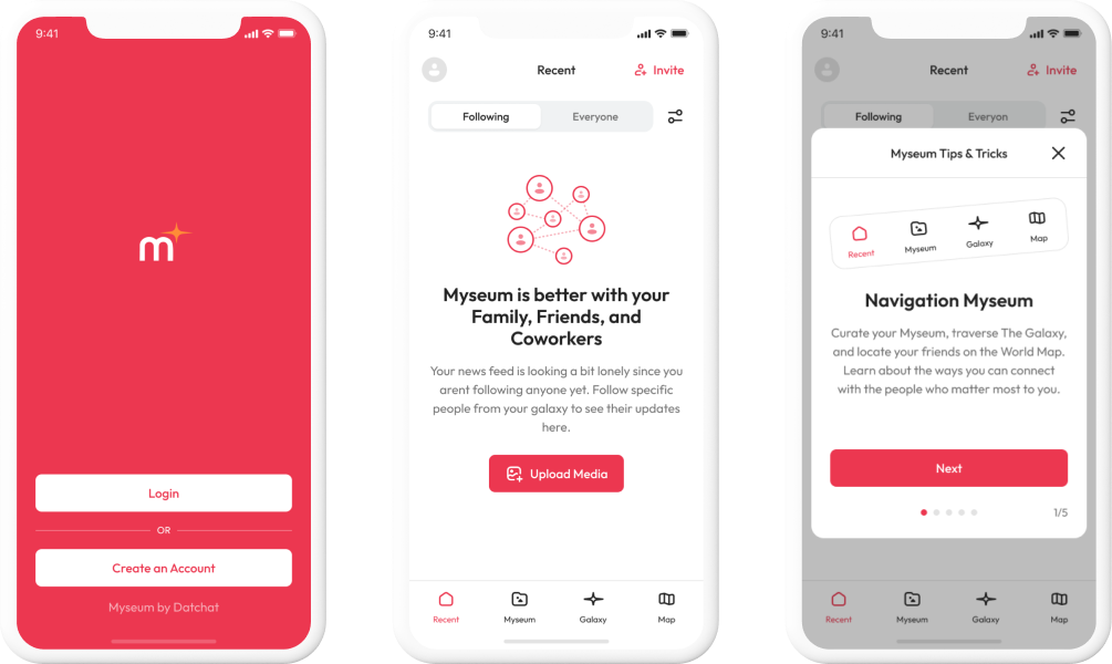
New Design Approach: Building a Thoughtful First Impression
Our new design approach focused on making the onboarding experience intuitive, welcoming, and emotionally aligned with the purpose of Myseum—preserving personal memories and fostering private connections. Core Design Goals:
- Simplify the Journey - We reduced friction by streamlining steps, consolidating inputs, and removing unnecessary complexity from the registration process.
- Guide with Clarity - Each screen provides context and cues to help users understand what’s expected and why it matters, improving confidence and task completion.
- Infuse Emotional Resonance - The visual tone was softened with calming colors, rounded UI components, and minimal yet meaningful microcopy to reflect the sentimental value of the platform.
- Enable Trust from the Start - Improved error handling, real-time feedback, and transparent messaging reassured users and built confidence throughout the flow.
- Personalized Onboarding - Role- and interest-based entry points were explored to tailor the user’s first-time experience and connect them more deeply with the app’s purpose.
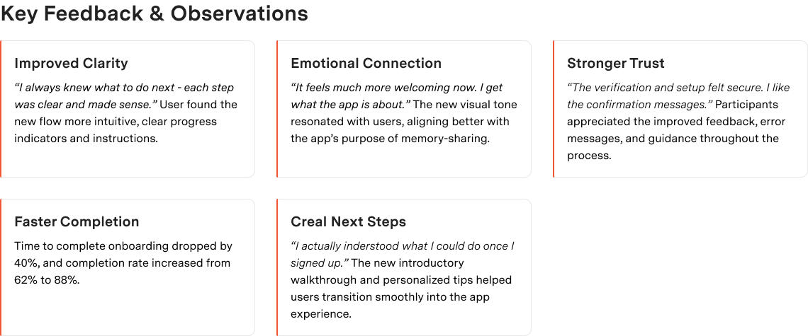
User Testing Feedback: Validating the Redesigned Experience
To evaluate the effectiveness of the new onboarding flow, we conducted moderated user testing sessions with a diverse group of participants. The goal was to gather real-time reactions, uncover usability issues, and measure improvements against the original design. Testing Setup
- Participants: 10 users (ages 25–45), mix of tech-savvy and less-experienced mobile users
- Method: Remote moderated testing using a clickable prototype
- Focus Areas: Ease of navigation, task clarity, emotional response, and overall satisfaction