Intuitive IVR Automation Interface for Patient Engagement
- Health Care
- Salesforce
- Workflow
- Enterprise
- Workflow
- Funnel Builder
.png)

Business Scope
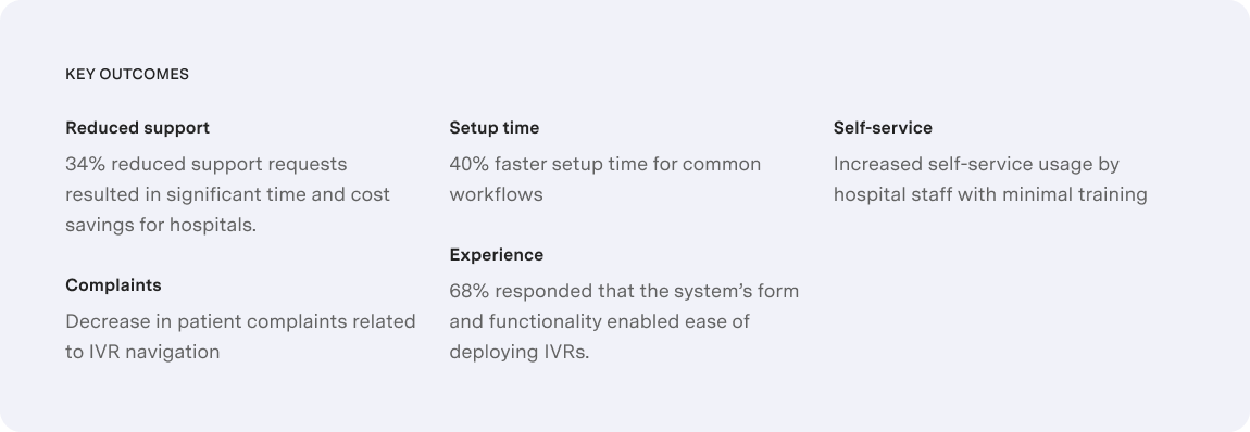
The project aimed to modernize a legacy IVR system by leveraging Salesforce as the base framework, enabling hospital admins to independently configure and manage call flows without developer support. It also focused on improving patient engagement by simplifying voice interactions and streamlining post-discharge communication.
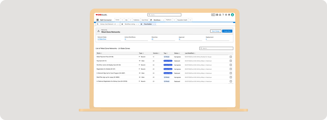
- Product Modernization - Redesign the existing IVR interface to replace the outdated, developer-dependent experience with a modern, no-code configuration platform that empowers hospital staff to build and manage IVR workflows independently.
- Improved Administrative Efficiency - Enable front desk and administrative users—non-technical by nature—to create, modify, and deploy IVR flows without involving IT, thereby reducing operational costs and turnaround time.
- Enhanced Patient Engagement - Simplify the patient experience by reducing menu complexity and improving call routing logic to ensure faster access to the right information or support—especially during post-discharge scenarios.
- Operational Scalability - Create a scalable platform that can handle multi-location deployments, accommodate different hospital workflows, and reduce the reliance on the client’s support team for ongoing configuration and maintenance.
- Strategic Differentiation - Position the IVR solution as a self-service automation platform in the competitive healthcare market, delivering value not just through technical capability, but through ease of use, rapid deployment, and improved patient outcomes.
Challenges
The existing IVR interface created a high barrier to entry for non-technical users. Even minor updates required IT intervention, increasing cost and turnaround time. Admins struggled with navigating a cluttered, outdated interface filled with unnecessary options and unclear labels.
- Resource-Intensive Deployment: Basic tasks required training and technical support due to poor UI architecture.
- Resource-Intensive Deployment: Basic tasks required training and technical support due to poor UI architecture.
- Patient Friction: Complex, non-intuitive IVR menus frustrated patients and caused communication breakdowns.
- High Support Load: Increased configuration-related errors drove up support requests and strained internal resources.
.png)
Design Process
Getting a bird’s eye view of the product. We started by conducting user interviews with hospital admins, patients, and caregivers from broad levels of expertise, from beginners and intermediate to experts to collect information.
User Interviews
We conducted in-depth interviews with hospital front desk administrators to understand their pain points and existing workflows when setting up the IVR for a particular workflow to identify their frustrations with the current interface and explore their needs and expectations for an ideal solution.Task Analysis
We observed administrators performing common tasks such as creating IVR menus, making changes to existing options, and troubleshooting issues. This helped identify specific areas for improvement and opportunities to streamline processes.Affinity Mapping
We extracted data points from user interviews, task analysis observations, and usability testing results. Key data points such as quotes, behaviors, and pain points were then classified into themes. The final groupings were analyzed to identify key insights about user frustrations, desired functionalities, and workflow preferences, which would inform the design direction..png)
Research Findings
Patient quote: “This IVR system is a maze! I just wanted to schedule a follow-up appointment, but I keep getting looped back to the main menu. By the time I get a person, I’ll be too frustrated to even explain why I called.” Admin quote: “We keep wanting to test different IVR greetings and workflows or even add new departments or services to improve patient experience, but making tweaks is a slow process.”
- The dated and obscure UI of the existing system had no classification for frequent and advanced actions.
- Configuring a simple automation workflow took a lot of work, especially for inexperienced users.
- The system lacked guidance to help users make sense of the multiple options available.
UX Strategy
IVR automation systems, while generally similar across industries, have some key differences when deployed in healthcare settings:
.png)
We therefore had to design a system that anticipates and gracefully handles user errors and ensures human intervention at the right time considering the fragile state of mind that the patients (disturbed/aged/anxious) and admins (distracted, busy) user groups may be in. It was critical to design a system that would provide clear and actionable feedback to users when issues arise, guiding them toward a solution that wouldn’t require developer intervention.
.png)
Ideation
Our solution was focused on building a UI that would guide the users to take the right action intuitively, rather than having them explore and wonder what they must do. It would display only the essential options required to deploy the IVR workflow which makes it easy to operate with minimal training & instruction. We had to ensure that the color palette was soothing and did not hamper the focus of the users. All buttons and pills would have to be labeled to be self-explanatory, removing all traces of speculation and wrong, unintended clicks.
.png)