The Provider Resource Center (PRC) serves as the digital front door to Leading provider network. It is a vital touchpoint in the clinician experience, providing access to essential information, tools, and policies. PRC plays a critical role in enabling healthcare providers to stay informed, self-serve efficiently, and participate in key programs that support patient care.
Provider Resource Center (PRC) Redesign

- CMS. Adobe AEM
- Health Care
- New Design System Update
- Redesign
- 2023
Overview
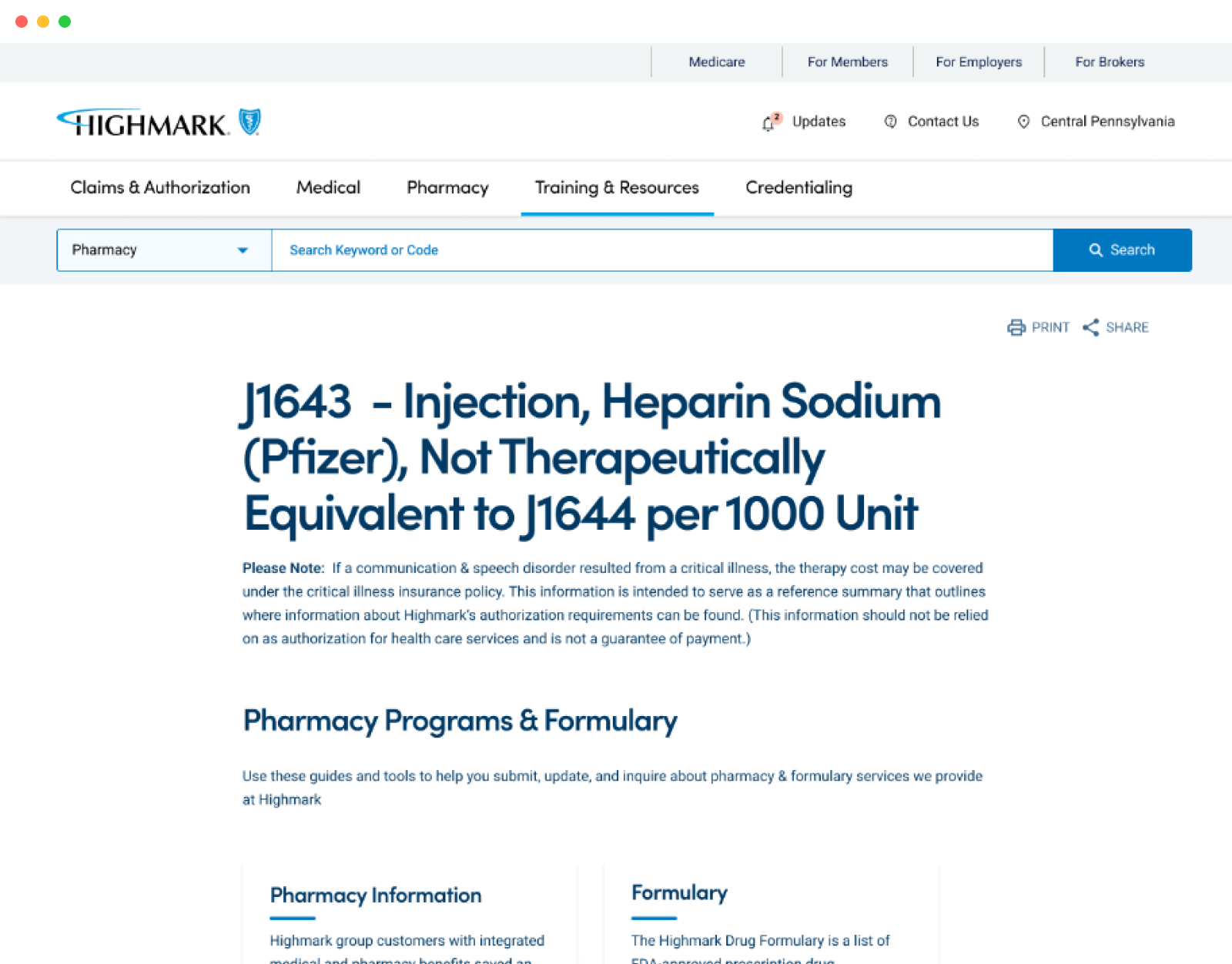
The Provider Portal is a centralized digital platform that serves as a critical interface between Highmark and its provider network. It offers access to essential resources, including policy updates, credentialing information, claim status, reimbursement guidelines, and program participation tools. Designed to support both clinical and administrative workflows, the portal enables providers to self-serve, stay informed, and engage with Highmark more efficiently—ultimately enhancing care delivery and operational effectiveness.
Design Process
I focused on creating an intuitive, accessible experience that simplifies the Provider Portal—making it easier for users to explore, locate resources, and access essential forms and manuals. Here's a breakdown of the process:
Research & Ideation
To begin, we analyzed the needs and behaviors of provider users, many of whom found the existing site overly complex and overwhelming. The volume of content made it hard to identify what was relevant. These insights shaped early concepts, leading us to explore guided experiences and simplified content pathways.Flow Mapping
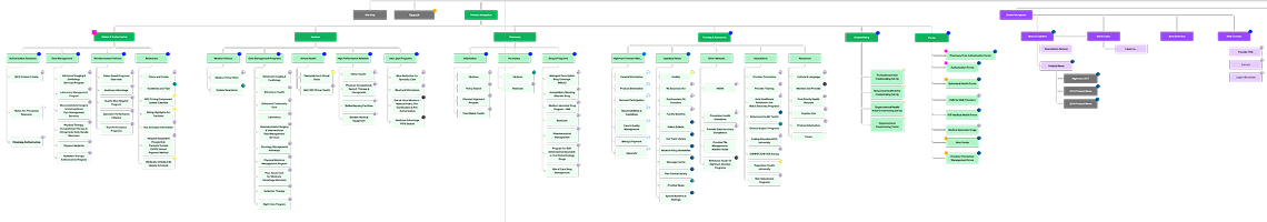
I mapped user journeys step-by-step to ensure the experience felt logical, smooth, and focused. The goal was to reduce friction and cognitive load. A contextual chat assistant was introduced to act as a digital guide, offering support where needed. Analytics helped identify the most visited sections and prioritize them in the navigation structure.Wire-framing
Mid-fidelity wireframes were developed to visualize key flows, layouts, and page structures. This allowed for early usability testing, where we gathered feedback on task clarity and interaction points. One insight was the need for users to edit their selections post-result, which was incorporated into the flow. We also leveraged standard page layouts from Highmark’s existing AEM design system to align with platform constraints.Concept Design
With the experience mapped, I explored visual styles that aligned with Highmark’s updated design language—clean, modern, and calm. The goal was to create an interface that felt welcoming and trustworthy, while working within the limitations and capabilities of AEM’s component library.Final Design
The final design emphasized intuitive navigation, clearly defined interactions, and thoughtful layout. Subtle AI enhancements were introduced to assist without overwhelming the user. Attention was paid to hierarchy, responsiveness, and accessibility to support a wide range of user needs.Implementation & Iteration
Throughout the development sprints, I conducted hands-on functional testing to identify UX gaps and inconsistencies. Rapid feedback loops allowed us to iterate and refine before release, ensuring a high-quality, user-friendly launch.Research
Who We Engaged : To build a deeper understanding of the current Provider Resource Center (PRC) experience, we conducted a series of interviews, workshops, and reviews with key stakeholders and user representatives :
- Internal Stakeholders – Including leaders from operations, product, and IT
- Provider Advisory Leaders (PALs) – Group sessions with 22 PALs, representing diverse provider perspectives
- Operations Teams – Including Reporting, Credentialing, Provider Information Management, and Utilization Management
- Module Deep Dives – Focused sessions to understand specific functional areas and workflows
- Heuristic Reviews – Expert UX evaluations of current PRC usability and content structure
- Usage Data Analysis – Review of analytics to uncover behavioral patterns and engagement gaps
What We Learned
Key themes that emerged from our research:
- Payment Transparency : Providers primarily access PRC to determine if and how they will be reimbursed.
- Credentialing Clarity : Understanding credentialing status and process is a major need.
- Information Overload : Users feel overwhelmed by excessive and poorly organized content.
- Poor Information Accessibility : Providers struggle to locate important information quickly—often resulting in confusion, errors, or missed updates.
- Lack of Trust in Content : Providers expressed uncertainty about the accuracy and reliability of the information presented.
- Navigation Confusion : Many struggled to understand the site’s structure and how to access specific resources.
- Low Awareness : A significant number of providers were not aware of the PRC or its purpose.
- Denial Troubleshooting : Difficulty in resolving claim denials due to lack of clear guidance and resources.
- Findability Issues : Core content is often buried or hard to access, leading to inefficiencies and frustration.
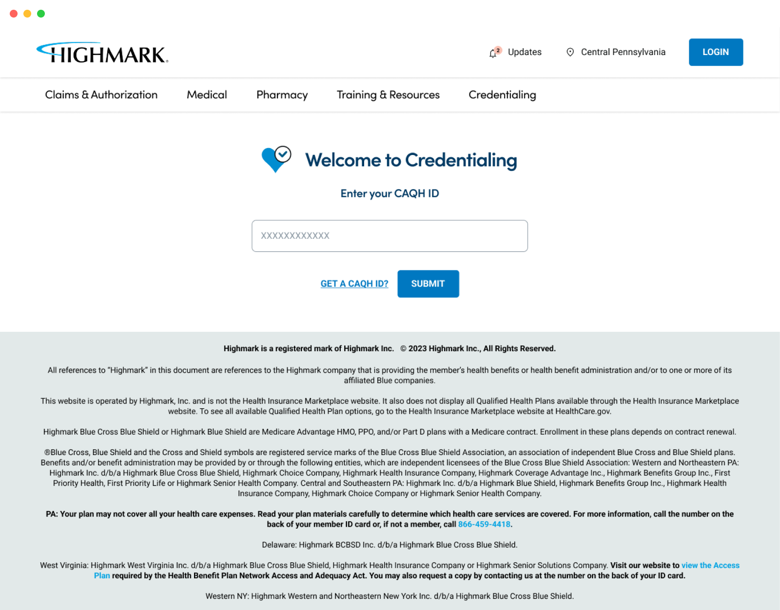
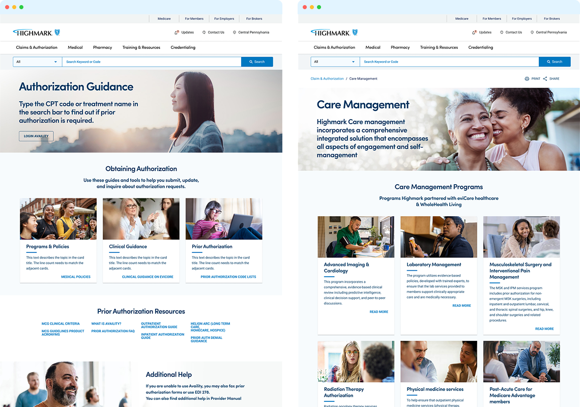
Design Structure Framework
Leveraging the newly established design system, we developed a flexible and reusable set of design patterns that ensure consistency across all PRC modules. The framework emphasizes accessibility, clarity, and ease of navigation—supporting multi-level page structures and contextual inline links to help providers quickly find what they need.
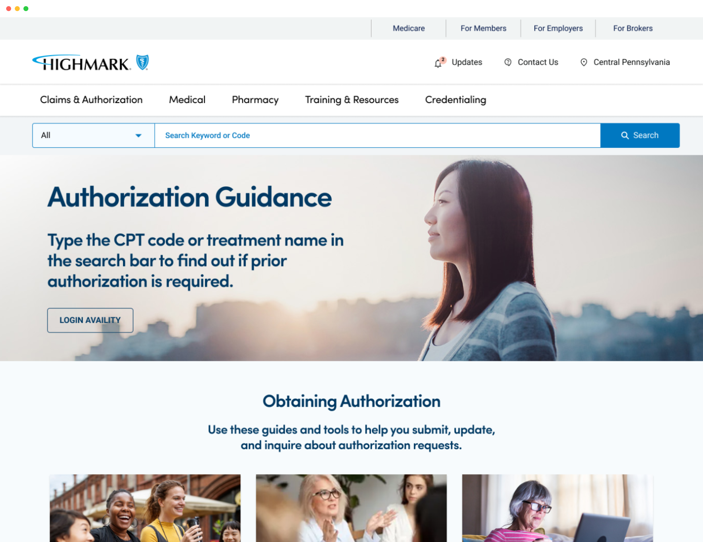
Key Layout Elements
- Modular Page Templates – Reusable templates for policy pages, resource hubs, and program overviews
- Sticky Subnavigation – Always-visible secondary navigation for easier access to key sections on long pages
- Inline Resource Links – Embedded links within content blocks for quick access to related forms, manuals, and tools
- Expandable Accordions – For organizing dense content like FAQs, guidelines, and policy details without overwhelming the user
- Multi-Level Page Hierarchy – Clear breadcrumb trails and structured paths to support deep navigation
- Quick Access Panels – Context-aware toolbars or banners highlighting high-priority actions or resources
- Role-Based Content Sections – Region- and role-specific visibility rules to show only what’s relevant
- Searchable Resource Library – Unified, filterable access to all documents and forms
.png)
.png)
.png)